
Sentience –
New Logo & Visual Identity
Guided by Sentience’s commitment to integrity, precision, and reliability, I led the visual design for their rebranding project. Drawing inspiration from their innovative approach to gaming user behavioral analytics and personalized AI solutions, I crafted a design language that reflects their mission to enhance user experiences. My work brought their values to life visually, empowering the brand to connect more meaningfully with its audience and stand out in a competitive market.


3 KEYPOINTS
Sense
+
Iris
+
Recognition
=
Sentience
Sense + Iris + Recognition = Sentience
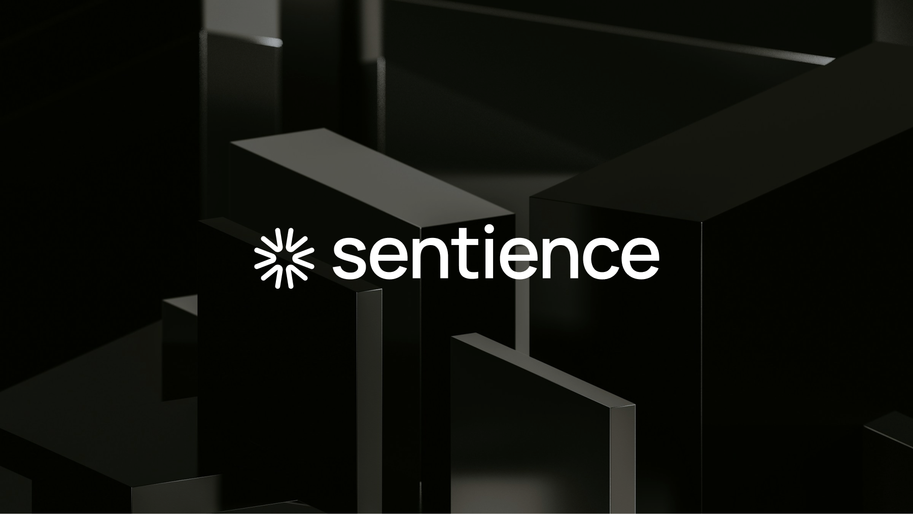
The logo for Sentience, a gaming AI company focused on user analytics, is rooted in three core ideas: sense, iris, and recognition. These keywords guided the creative direction, forming a visual identity that reflects both the intelligence and perceptiveness of the product. At its heart, Sentience is about making sense of player behavior—distilling raw data into meaningful insights that inform game design and player engagement strategies.
The symbol evokes the form of an iris or a sensor, subtly hinting at perception and awareness—an homage to the brand’s name. It also suggests a data interface: a gateway through which patterns are observed, analyzed, and acted upon. The clean, geometric design aims to communicate clarity, precision, and a futuristic ethos, resonating with potential partners and clients in the gaming and tech space. This logo not only represents the company’s analytical power, but also its ambition to be seen and recognized as a forward-thinking force in the industry.

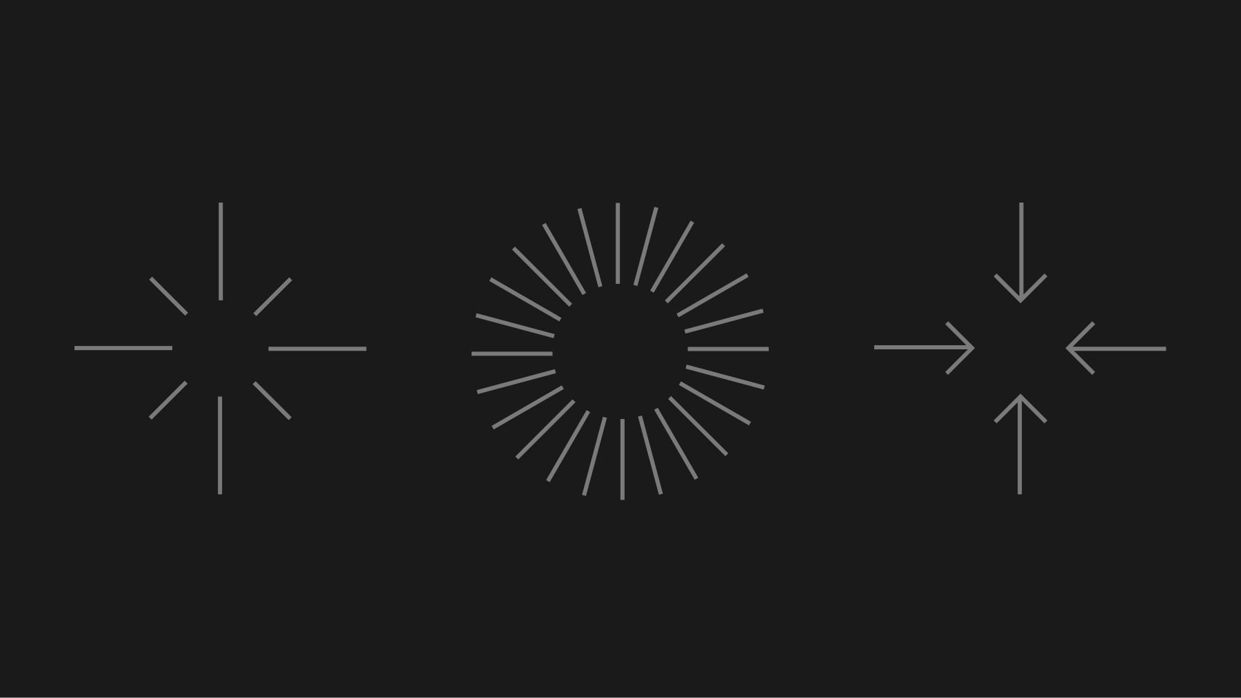
The composition of the logo grid
The Sentience logo was designed based on a precise geometric structure. At its center lies a hexagon—a natural and perfect shape—that symbolically represents technology and intelligence. Using this hexagon as a foundation, a radial grid was constructed, upon which each element of the logo was placed in balanced alignment, resulting in a harmonious and systematic form. This compositional method not only brings clarity and order to the logo, but also visually conveys the brand’s analytical nature—interpreting complex data into meaningful forms. Logical yet intuitive, the logo is a visual embodiment of Sentience’s core values.

A Refined Yet Dynamic Identity
To translate Sentience’s brand identity into visual language, we crafted a color palette grounded in deliberate contrast and sophisticated harmony. ‘Sense Dark’ embodies the brand’s reliability and technical depth, instilling a sense of stability across the user interface. In contrast, ‘Sense Turquoise’ and ‘Sense Violet’ capture the energy of a fast-moving tech landscape, emphasizing innovation and a forward-looking spirit. This color system was thoughtfully designed to intuitively reflect the brand’s core values—precision, trust, and user-centricity—through color alone.


Designing for Instant Clarity—with a Glimpse of the Brand
To represent Sentience—a company working with the intangible world of AI—we created signage and outdoor advertising that delivers key information at a glance, while subtly revealing the brand’s identity in the background. This visual approach allows the audience to quickly understand what Sentience offers, while simultaneously experiencing the essence of the brand through refined and intentional design cues.

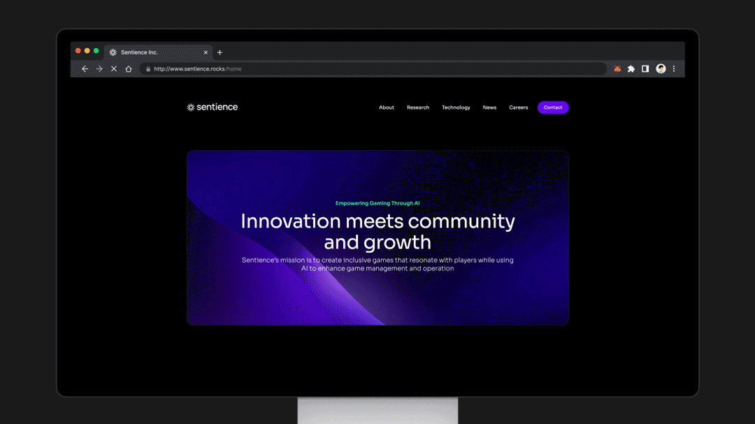
New Branding, New Website
The new website was built on Webflow to align with the brand and allow for easy CMS management. Sentience’s rebranded site features a dark background with neon-accented highlights, visually emphasizing the brand’s technical depth and spirit of innovation. A minimal layout and intuitive information architecture enhance the user experience, while effectively communicating the reliability and expertise of its AI-powered solutions.
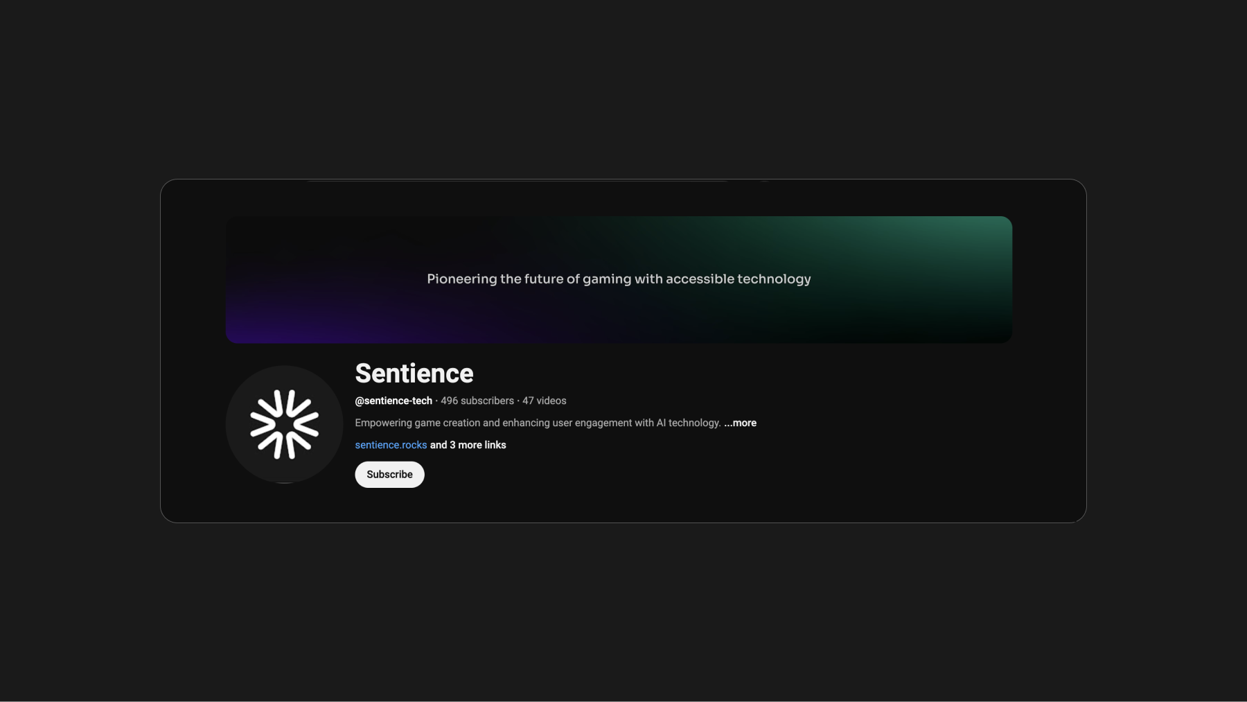
A Branded Carpet for Visitors of News & Webinars
You can’t leave out YouTube—the leading platform for video sharing—when it comes to branding. Sentience produces video content for company news, webinars, and more, providing subscribers and partners with flexible content that can be used across various platforms. The design is tailored to maintain brand consistency, ensuring that every viewer experiences a cohesive and recognizable identity, no matter where they encounter the content.


The Face and Pride of the Company
In external engagements and collaborations, a business card often serves as the face of a company—and a point of pride. Based on Sentience’s branding, we designed business cards that executives can confidently present, clearly conveying the identity of the subsidiary with all key information seamlessly integrated into the brand’s visual language. Additionally, the branded tote bag has become a signature fashion good, playing a subtle yet impactful role in reinforcing Sentience’s identity in everyday moments.
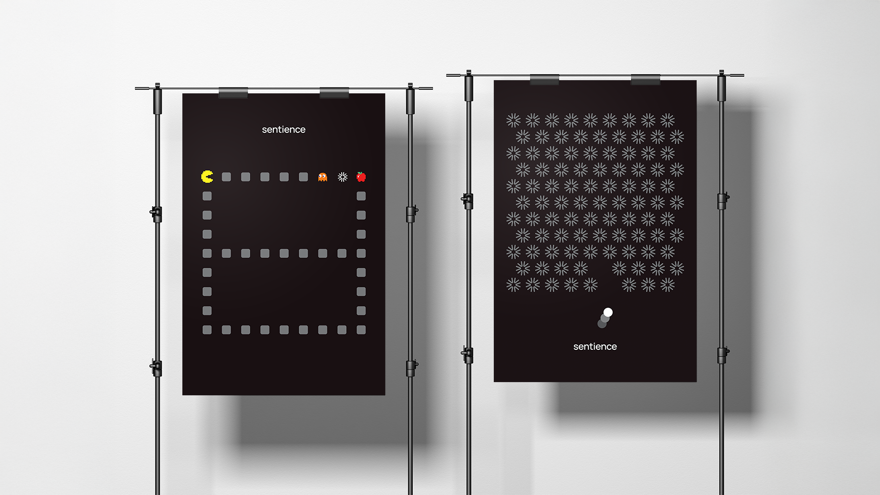
The Internal Branding Matters (too)
As a company that develops gaming AI, we created a series of playful posters inspired by legendary games—each reimagined with the Sentience logo and branding. These posters were displayed throughout the office, bringing a touch of humor and nostalgia that resonates with both the team and visitors. They’ve become great conversation starters, with guests often recognizing the game references and instantly connecting with the brand’s personality.
Credits
Bryan Jhung – Brand Design (concepting & execution)